Opal Data
NSW Transport recently released a new dataset of Opal (transportation card) tap on/offs for 2 weeks. Data
Initial Exploration
We’ll need to deal with any quirks of our data.
import pandas as pd
import numpy as np
import matplotlib.pyplot as plt

from datetime import datetime

plt.style.use("ggplot")
df = pd.read_csv("D:/Downloads/time-loc_20160725-31.csv", dtype={'date':'str'})
df.info()
<class 'pandas.core.frame.DataFrame'>
RangeIndex: 215630 entries, 0 to 215629
Data columns (total 6 columns):
mode     215630 non-null object
date     215630 non-null object
tap      215630 non-null object
time     215630 non-null object
loc      215630 non-null object
count    215630 non-null int64
dtypes: int64(1), object(5)
memory usage: 9.9+ MB
df.head()
| mode | date | tap | time | loc | count | |
|---|---|---|---|---|---|---|
| 0 | bus | 20160730 | on | 2:30 | 2000 | 415 |
| 1 | bus | 20160730 | on | 2:30 | 2135 | 18 |
| 2 | bus | 20160730 | on | 2:30 | -1 | 24 |
| 3 | bus | 20160730 | on | 2:30 | 2010 | 31 |
| 4 | bus | 20160730 | on | 13:30 | 2095 | 64 |
Looking at the data we can see that most of the data is in string format, and so we’re going to want to make some adjustments to our dates. We also see/know that the time and loc fields both contain a “-1” string when there was no relevant data.
df.groupby(["time"]).count()
df = df[df.time != "-1"]
df["datefull"] = df.date + " " + df.time
df["datefull"] = pd.to_datetime(df.datefull, format = "%Y%m%d %H:%M", utc = True)
df.info()
<class 'pandas.core.frame.DataFrame'>
Int64Index: 215581 entries, 0 to 215629
Data columns (total 7 columns):
mode        215581 non-null object
date        215581 non-null object
tap         215581 non-null object
time        215581 non-null object
loc         215581 non-null object
count       215581 non-null int64
datefull    215581 non-null datetime64[ns]
dtypes: datetime64[ns](1), int64(1), object(5)
memory usage: 13.2+ MB
Data Visualisation
Even with a fairly basic dataset, we can explore quite a few different avenues, and see if we can answer some basic questions. Areas of interest include:
- Regular behaviour of travellers (time & mode)
- Location
- Ratios of tap on/tap offs
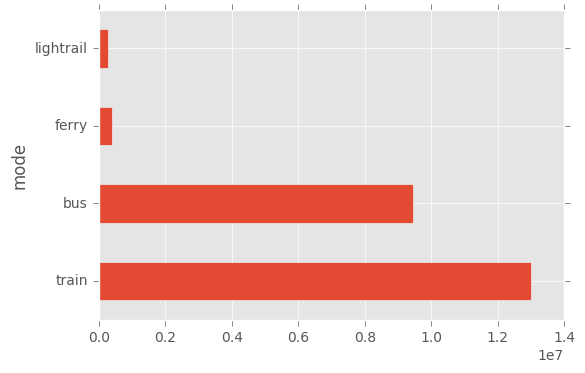
df.groupby(["mode"]).sum()["count"].sort_values(ascending = False).plot(kind="barh")
plt.show()
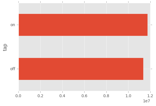
df.groupby(["tap"]).sum()["count"].plot(kind="barh")
plt.show()
Time Analysis
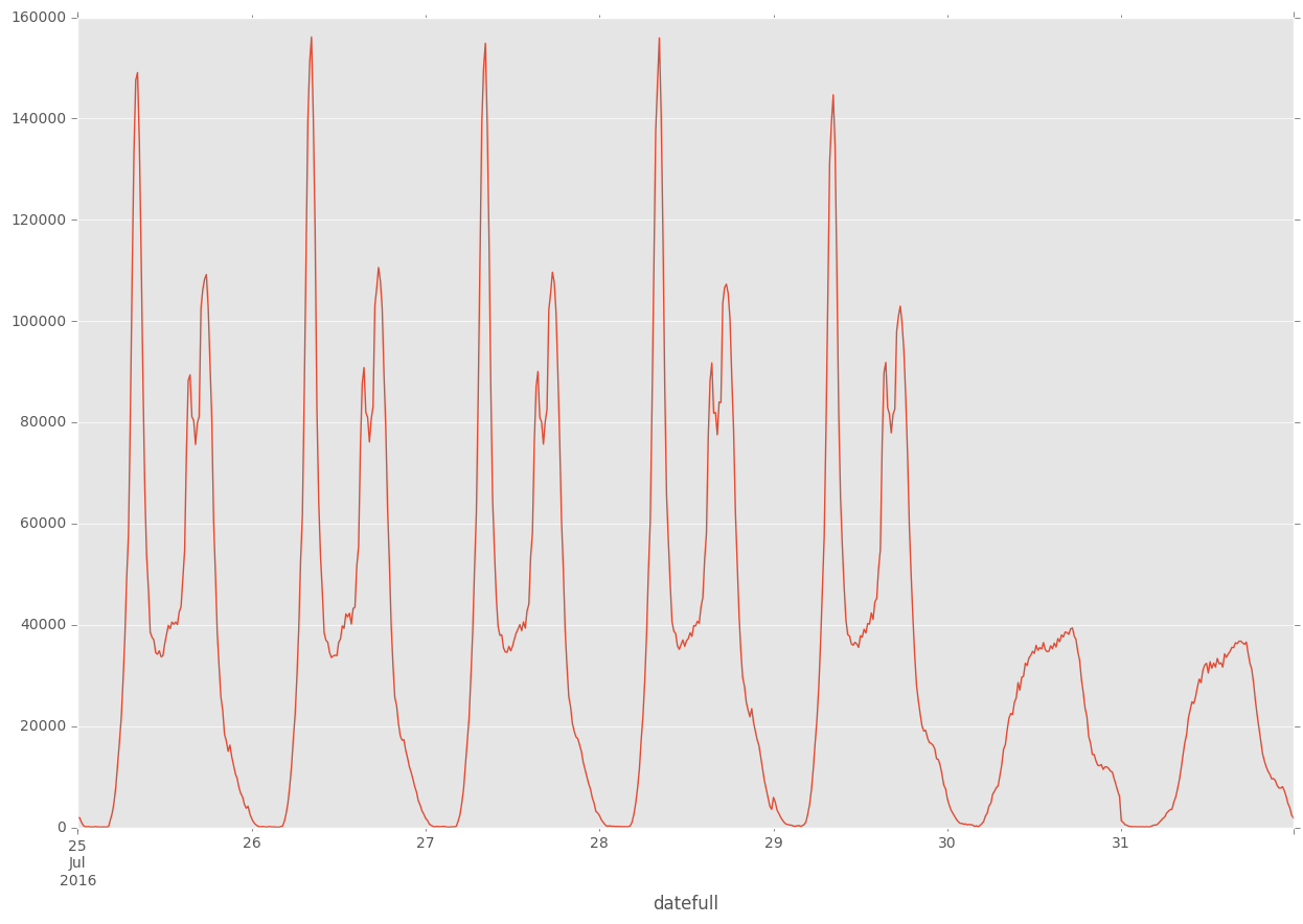
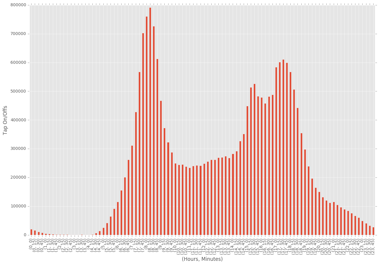
We expect some fairly regular behaviour from travellers during the week, with hours being dominated by peak travel hours in the morning/evening. We can explore both trends across the week, as well as trends across the day.
plt.figure(figsize=(15,10))
df.groupby(["datefull"]).sum()["count"].plot()
plt.show()
times = pd.DatetimeIndex(df.datefull)

plt.figure(figsize=(15,10))
df.groupby([times.hour, times.minute])["count"].sum().plot(kind="bar")
plt.xlabel("(Hours, Minutes)")
plt.ylabel("Tap On/Offs")
plt.show()
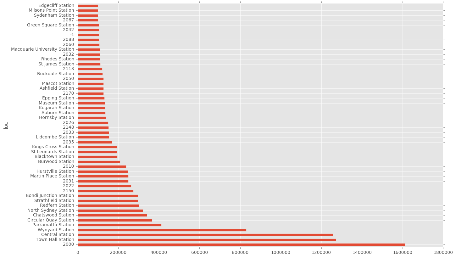
Location Analysis
Naturally we expect the Sydney CBD to dominate in usage, given the high thoroughfare through these areas in terms of population and workers.
plt.figure(figsize=(15,10))
df.groupby(["loc"])["count"].sum().sort_values(ascending=False)[0:50].plot(kind="barh")
plt.show()
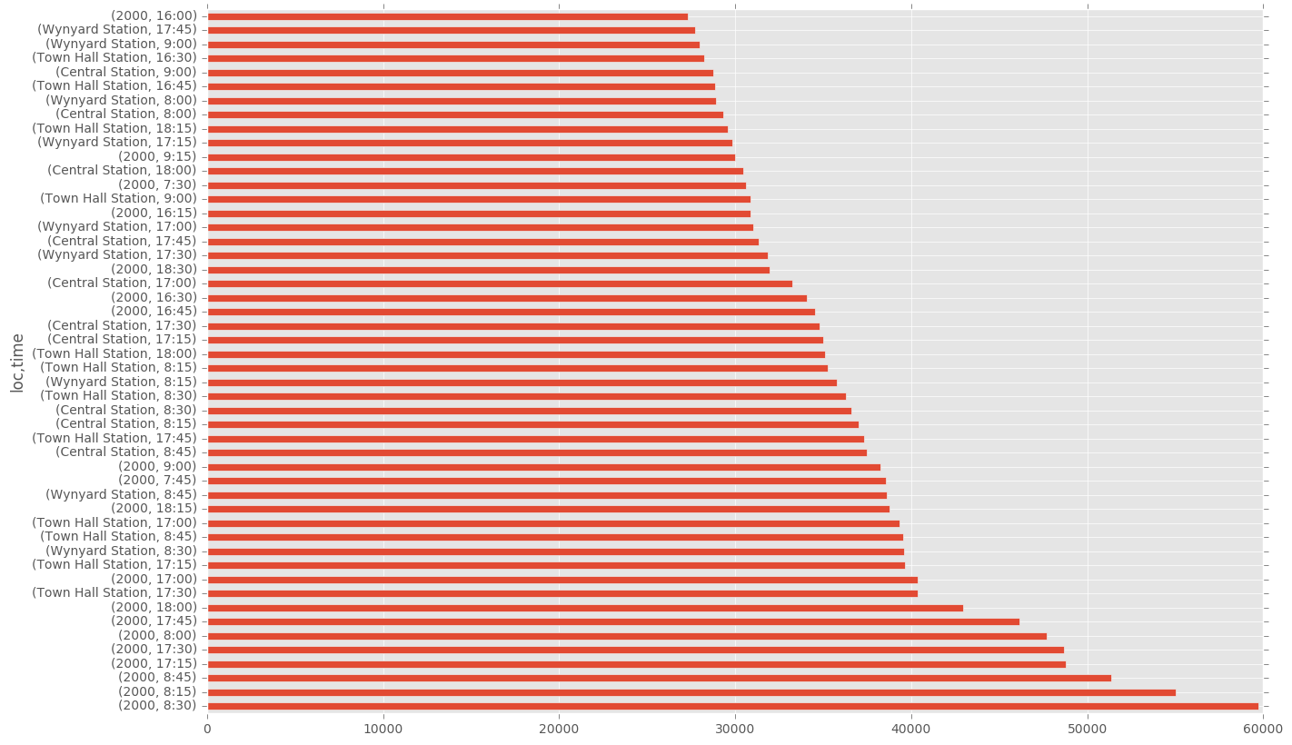
Another interesting area is to test location and time of tap on/off. I would expect more regularity in peoples departure times in the morning, and so would expect to see more tap-ons in the morning as opposed to the evening.
plt.figure(figsize=(15,10))
df.groupby(["loc", "time"])["count"].sum().sort_values(ascending=False)[0:50].plot(kind="barh")
plt.show()
plt.figure(figsize=(15,10))
df.groupby(["mode", "time"])["count"].sum().sort_values(ascending=False)[0:50].plot(kind="barh")
plt.show()
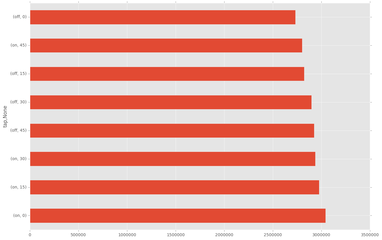
plt.figure(figsize=(15,10))
df.groupby(["tap", times.minute])["count"].sum().sort_values(ascending=False)[0:50].plot(kind="barh")
plt.show()
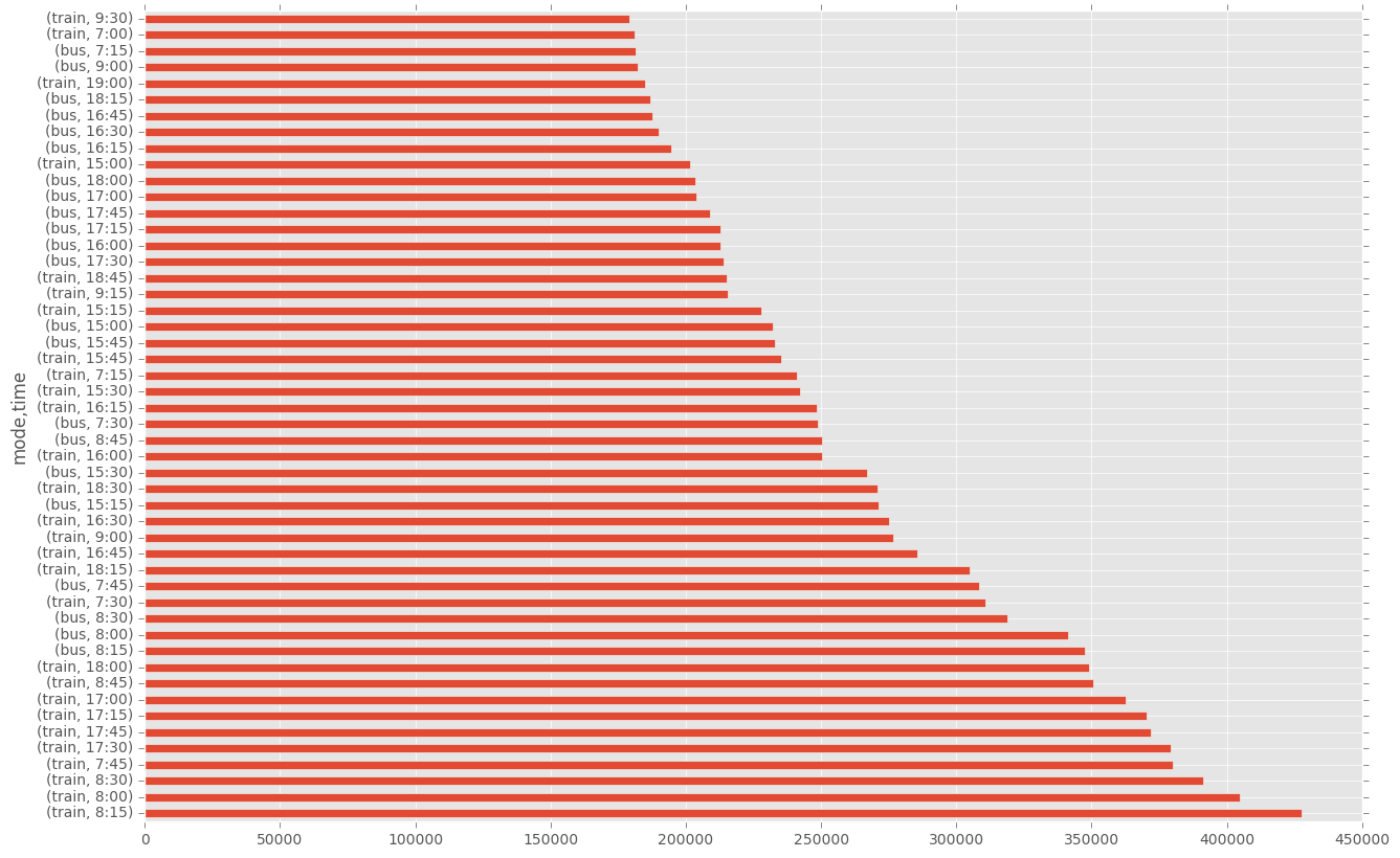
Mode Analysis
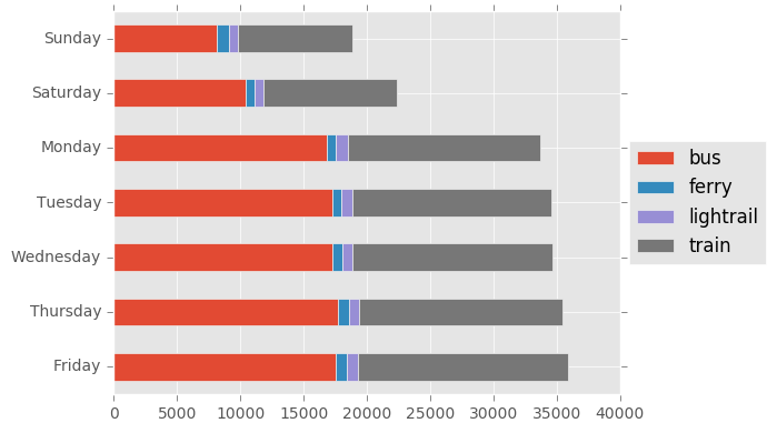
In Sydney I expect trains and buses to be the dominant form of transport. We can look at both daily and hourly trends.
cr_counts = pd.DataFrame(df["mode"].value_counts())
top10 = df
tmp2 = pd.DataFrame(top10.groupby([times.day,"mode"]).size(), columns = ['count'])
tmp2.reset_index(inplace=True)
tmp2 = tmp2.replace({25:"Monday",
                        26:"Tuesday",
                        27:"Wednesday",
                        28:"Thursday",
                        29:"Friday",
                        30:"Saturday",
                        31:"Sunday",})

tmp2 = tmp2.pivot(index="level_0", columns = "mode", values = 'count')
tmp2["total"] = tmp2.sum(axis=1)
tmp2 = tmp2.sort_values(by = "total", ascending = False)


del tmp2["total"]

tmp2.plot(kind = 'barh', stacked = True)
plt.legend(loc='center left', bbox_to_anchor=(1.0, 0.5))
plt.ylabel("")
plt.tight_layout()
plt.show()
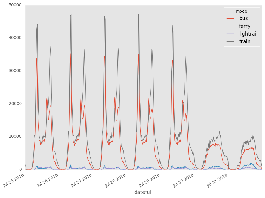
f = plt.figure(figsize = (13,8))
ax = f.gca()
#Plots by year
df_cat = df[df["tap"] == "off"]
df_cat = df_cat[["datefull", "mode", "count"]]
df_cat = df_cat.groupby([df_cat["datefull"], "mode"]).sum()["count"]
df_cat.unstack().plot(ax=ax)
box = ax.get_position()
ax.set_position([box.x0, box.y0, box.width*0.8, box.height])
plt.show()
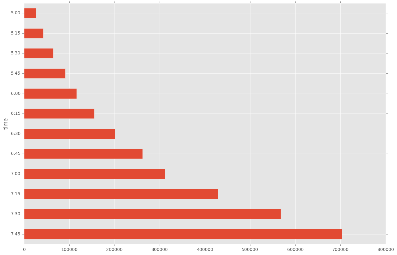
plt.figure(figsize=(15,10))
tmp = df[((times.hour < 8) & (times.hour > 4))]
tmp.groupby(["time"])["count"].sum().sort_values(ascending=False)[0:50].plot(kind="barh")
plt.show()
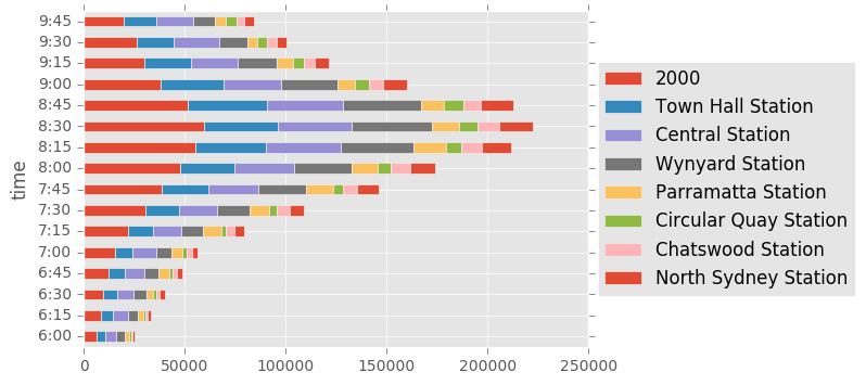
Extra Analysis
We can now look at some more complicated charts, by breaking up interesting areas of analysis into different compartments. The first one is to look at a breakdown of times based on the major stations that are being used.
tmp = df[((times.hour <= 9) & (times.hour >= 6))]
cr_counts = tmp.loc[:, ["loc", "count"]].groupby(["loc"]).sum()["count"]
df_run = tmp.loc[:, ["time", "loc", "count"]].groupby(["time","loc"])
tmp2 = pd.DataFrame(df_run.sum()["count"], columns = ['count'])
tmp2.reset_index(inplace=True)
tmp2 = tmp2.pivot(index="time", columns = "loc", values = 'count')
vals = df.groupby(["loc"])["count"].sum().sort_values(ascending=False)[0:8]
tmp2[vals.index].plot(kind="barh", stacked = True)
plt.legend(loc='center left', bbox_to_anchor=(1.0, 0.5))
plt.show()
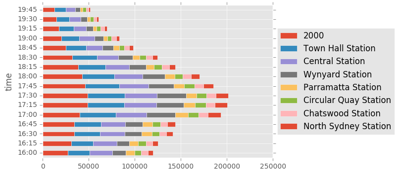
tmp = df[((times.hour <= 19) & (times.hour >= 16))]
cr_counts = tmp.loc[:, ["loc", "count"]].groupby(["loc"]).sum()["count"]
df_run = tmp.loc[:, ["time", "loc", "count"]].groupby(["time","loc"])
tmp2 = pd.DataFrame(df_run.sum()["count"], columns = ['count'])
tmp2.reset_index(inplace=True)
tmp2 = tmp2.pivot(index="time", columns = "loc", values = 'count')
vals = df.groupby(["loc"])["count"].sum().sort_values(ascending=False)[0:8]
tmp2[vals.index].plot(kind="barh", stacked = True)
plt.legend(loc='center left', bbox_to_anchor=(1.0, 0.5))
plt.show()
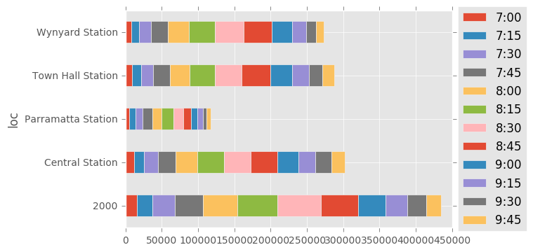
tmp = df[((times.hour <= 9) & (times.hour >= 7))]
cr_counts = tmp.loc[:, ["loc", "count"]].groupby(["loc"]).sum()["count"]
df_run = tmp.loc[:, ["time", "loc", "count"]].groupby(["time", "loc"])

tmp2 = pd.DataFrame(df_run.sum()["count"], columns = ['count'])

tmp2.reset_index(inplace=True)
tmp2 = tmp2.pivot(index="loc", columns="time", values='count')


plt.figure(figsize=(15,10))
vals = df.groupby(["loc"])["count"].sum().sort_values(ascending=False)[0:5]
tmp2[tmp2.index.isin(vals.index)].plot(kind="barh", stacked = True)
plt.legend(loc='center left', bbox_to_anchor=(1.0, 0.5))
plt.show()
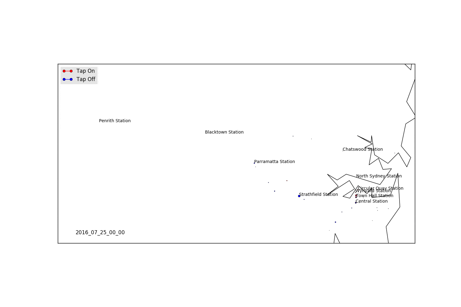
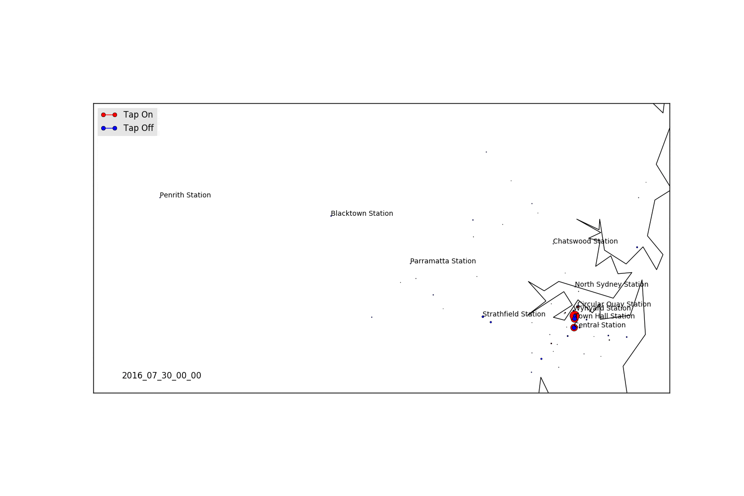
Time-Evolving Maps
Our first step is to get the latitudes and longitudes for all of our locations. We can push this through the Googlemaps API see here for some more info. We’ll iterate through our list of post codes and station names, and pull all our latitudes/longitudes and then join them to our initial dataset.
import requests

# Initialise our dataframe to store our latitude and longitude data
suburbs = pd.DataFrame(np.unique(df["loc"]), columns = ["loc"])
suburbs["lat"]= np.zeros(len(suburbs))
suburbs["lon"] = np.zeros(len(suburbs))
failed = []

for i in range(0, len(suburbs)):
    temp = suburbs.loc[i, "Suburb"]
    try:
        # Create the address we want to retriever from GoogleMaps
        addr = temp + ",+NSW,+Australia"
        response = requests.get('https://maps.googleapis.com/maps/api/geocode/json?address='+addr)
        resp_json_payload = response.json()
        data = resp_json_payload['results'][0]['geometry']['location']
        lat = data["lat"]
        lon = data["lng"]
        #print(addr," ",lat," ",lon)
    except:
        # Create a list of fails, and then we can deal with individually if we have to
        failed.append(temp)
        lat = "NA"
        lon = "NA"
        print("No data on ", temp)

    suburbs.loc[i, "lat"] = lat
    suburbs.loc[i, "lon"] = lon

suburbs[suburbs["Suburb"] == "-1"] = [-1, "NA", "NA"] # -1 actually retrieves an address, so we want to set it to NA.
suburbs.to_csv("suburb_list.csv")
df = df.merge(suburbs, on = "loc", how = "left")
from mpl_toolkits.basemap import Basemap
import matplotlib.lines as mlines

data_20160725 = df#[df.date == "20160725"] # Filter on a specific date

# Loop through all  individual times
for t in np.unique(data_20160725.datefull):
    fig = plt.figure(figsize=(15,10))

    # Extract out relevant date (latitude, longitude, type of tap and total counts)
    data = data_20160725[data_20160725.datefull == t]
    data = data.groupby(["lat", "lon", "tap"]).sum()["count"]
    vals = data.index.get_values()
    x = [x for x,y,z in vals]
    y = [y for x,y,z in vals]
    taps = [z for x,y,z in vals]
    # Create a new dataframe which is grouped by unique lat/lons
    new_data = pd.DataFrame(columns = ["x", "y", "taps", "count"])
    new_data["x"] = x
    new_data["y"] = y
    new_data["taps"] = taps
    new_data["count"] = data.values

    on_data = new_data[new_data.taps == "on"]
    off_data = new_data[new_data.taps == "off"]

    ####################################################################################
    # Create the Basemap object, set the lon/lat for our map
    m = Basemap(projection='merc',
    resolution = 'i', llcrnrlon=150.614385, llcrnrlat=-33.949563,
              urcrnrlon=151.324376, urcrnrlat=-33.653431,)

    m.drawcoastlines()
    m.drawcountries()
    m.drawmapboundary(fill_color='white')

    # Transform points into Map's projection
    xs,ys = m(list(on_data["y"]), list(on_data["x"]))

    crimes = on_data["count"]

    # Iterate over tap on/tap off data, and scale marker based on density
    min_marker_size = 10
    for lon, lat, mag in zip(list(on_data["y"]), list(on_data["x"]), crimes):
        x,y = m(lon, lat)
        msize = mag/200 * min_marker_size
        m.plot(x, y, 'ro', markersize=msize)

    for lon, lat, mag in zip(list(off_data["y"]), list(off_data["x"]), off_data["count"]):
        x,y = m(lon, lat)
        msize = mag/200 * min_marker_size
        m.plot(x, y, 'bo', markersize=msize)


    name = pd.to_datetime(str(t)).strftime('%Y_%m_%d_%H_%M')
    plt.annotate('%s'%name, xy=(0.05,0.05), xytext=(0.05,0.05), xycoords='axes fraction', fontsize=12)

    # Manually set the legend, due to us varying the markersizes
    red_patch = mlines.Line2D([],[],color='red', marker='o', label='Tap On')
    blue_patch = mlines.Line2D([],[],color='blue', marker='o', label='Tap Off')
    plt.legend(handles=[red_patch, blue_patch], loc="upper left")

    # Write some station names to our map
    stations = ["Penrith Station", "Blacktown Station", "Parramatta Station", "Strathfield Station",
                "Central Station", "Town Hall Station", "Wynyard Station", "North Sydney Station",
				"Chatswood Station", "Circular Quay Station"]

    for i in stations:
        x,y = m(suburbs[suburbs["loc"] == i]["lon"].values, suburbs[suburbs["loc"] == i]["lat"].values)
        plt.text(x,y,i)

    fig.savefig("image/"+name+".png")
    plt.close(fig)
The above will produce us a whole bunch of images, but what we really want is an animated set of images!
import imageio
from os import listdir
from os.path import isfile, join
mypath = "/mypath/"
onlyfiles = [f for f in listdir(mypath) if isfile(join(mypath, f))]

t = ["2016_07_30" in x for x in onlyfiles]
files = list(compress(onlyfiles, t))
images = []
filenames = files
for filename in filenames:
    images.append(imageio.imread("image/"+filename))
imageio.mimsave('movie_20160730.gif', images)
Weekday
As expected, we see a massive influx of tap-offs in Sydney in the morning, and then the reversal at night. We also see the peak in Parramatta, and some other hubs which are high density employment locations.
Saturday
Areas for Further Exploration
- Turning above plots into more consistent heat maps
- Analysis of travel times based on average tap-on/tap-off times in major work hubs
- Analysis of tap-on/tap-off ratios at major stations
- Comparison against the August dataset