Analysis of NSW Government Fuel Check Data
Data NSW has the awesome tool which lets you see and compare fuel prices across the state. They also store and release datasets with a lot of fuel price history, which is ripe for us to have a look at! https://data.nsw.gov.au/data/dataset/fuel-check
import pandas as pd
import numpy as np
import matplotlib.pyplot as plt
import glob
import os
import seaborn as sns
path = r"D:\Downloads\Coding\NSW Petrol"
all_files = glob.glob(os.path.join(path, "*.csv"))
df_from_each_file = (pd.read_csv(f) for f in all_files)
df = pd.concat(df_from_each_file, ignore_index=True)

df["PriceUpdatedDate"] = pd.to_datetime(df.PriceUpdatedDate, dayfirst = True)
df['DayDate'] = df['PriceUpdatedDate'].apply(lambda x:x.date())
df = df[df.Price < 500] # Remove with pricing errors/anomalies
df.info()
df.head()
<class 'pandas.core.frame.DataFrame'>
Int64Index: 594064 entries, 0 to 594079
Data columns (total 10 columns):
Address               594064 non-null object
Brand                 594064 non-null object
FuelCode              519689 non-null object
FuelType              74375 non-null object
Postcode              594064 non-null float64
Price                 594064 non-null float64
PriceUpdatedDate      594064 non-null datetime64[ns]
ServiceStationName    594064 non-null object
Suburb                594064 non-null object
DayDate               594064 non-null object
dtypes: datetime64[ns](1), float64(2), object(7)
memory usage: 49.9+ MB
| Address | Brand | FuelCode | FuelType | Postcode | Price | PriceUpdatedDate | ServiceStationName | Suburb | DayDate | |
|---|---|---|---|---|---|---|---|---|---|---|
| 0 | 940 Pittwater Road & Hawkesbury Avenue, Dee Wh... | 7-Eleven | P98 | NaN | 2099.0 | 128.9 | 2016-09-01 00:01:35 | 7-Eleven Dee Why | Dee Why | 2016-09-01 |
| 1 | 940 Pittwater Road & Hawkesbury Avenue, Dee Wh... | 7-Eleven | P95 | NaN | 2099.0 | 123.9 | 2016-09-01 00:01:35 | 7-Eleven Dee Why | Dee Why | 2016-09-01 |
| 2 | 940 Pittwater Road & Hawkesbury Avenue, Dee Wh... | 7-Eleven | E10 | NaN | 2099.0 | 110.9 | 2016-09-01 00:01:35 | 7-Eleven Dee Why | Dee Why | 2016-09-01 |
| 3 | 940 Pittwater Road & Hawkesbury Avenue, Dee Wh... | 7-Eleven | U91 | NaN | 2099.0 | 112.9 | 2016-09-01 00:01:35 | 7-Eleven Dee Why | Dee Why | 2016-09-01 |
| 4 | North Parade (Mt Druitt Market Place), Mount D... | Caltex Woolworths | U91 | NaN | 2770.0 | 107.9 | 2016-09-01 00:04:08 | Caltex Woolworths Mount Druitt | Mount Druitt | 2016-09-01 |
Time Analysis
The first thing we’ll dive into is some time-series analysis of some key underlying trends surrounding petrol prices.
fig, ax1 = plt.subplots()
df.groupby(['DayDate']).mean()['Price'].plot(ax=ax1, label = 'Petrol Price')
ax1.set_ylabel("Average Petrol Price (cents)")
ax2 = ax1.twinx()
oil["CHRIS/CME_CL1 - Settle"].plot(ax=ax2, color='r', label='Oil Futures')
ax2.set_ylabel('Crude Oil Futures Contract Price')
ax2.grid(b=False)
plt.legend()
plt.show()
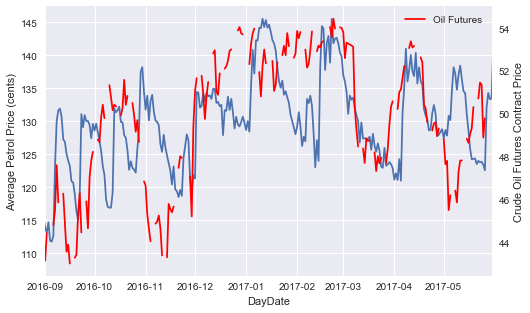
We see some very strong cycles occuring in petrol prices over each month. In late 2016 we see that there is a cycle occuring once every 2 weeks:
- Prices drop to low at start of month
- Prices increase to a high over one week
- Prices decrease to a low over two week
- Repeat cycle
We see that this cycle disappears almost completely in December, with prices stabilising and remaining at a fairly constant average ~$1.30/L, followed by a very large spike up to ~$1.45/L at the start of January. Two possible explanations for this are:
- Price increases due to demand over holiday period
- Price increase due to movement in price of the underlying
If we look at continuous crude oil future prices, we see that they were indeed reacing highs in January 2017 and the trends seem to move quite closely.
plt.figure(figsize=(10,5))
df.groupby(['DayDate']).std()['Price'].plot()
plt.ylabel("Petrol Price Standard Deviation")
plt.show()
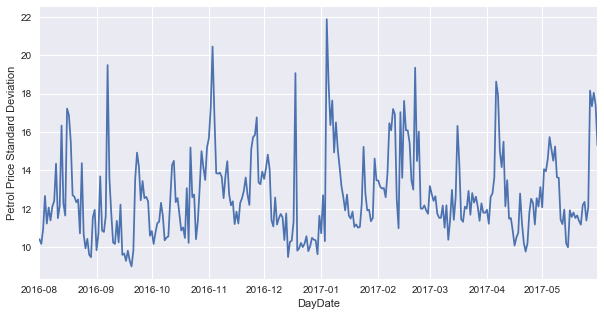
Interestingly, we see that there is quite a large amount of variance in petrol prices each day, sometimes greater then 20c difference! We see this large spike occuring in early January, which possibly indicates that there is significant price disparity going on with people needing to travel and petrol stations having more discretion to set prices due to the higher expected demand.
df.PriceUpdatedDate = pd.DatetimeIndex(df.PriceUpdatedDate)

fig, ax = plt.subplots(nrows=2, ncols=2, sharex=False, sharey=False, figsize = (15,20))

plt.subplot(221)
df.groupby([df.PriceUpdatedDate.dt.dayofweek])['Price'].mean().plot(kind='bar')
plt.ylabel("Petrol Price (cents)")
plt.xlabel("Day of Week (1=Sunday)")

plt.subplot(222)
df.groupby([df.PriceUpdatedDate.dt.month])['Price'].mean().plot(kind='bar')
plt.xlabel("Month of Year")

plt.subplot(223)
df.groupby([df.PriceUpdatedDate.dt.hour])['Price'].mean().plot(kind='bar')
plt.ylabel("Petrol Price (cents)")
plt.xlabel("Hour of Day")

plt.subplot(224)
df.groupby([df.PriceUpdatedDate.dt.minute])['Price'].mean().plot(kind='bar')
plt.xlabel("Minute of Hour")
plt.show()
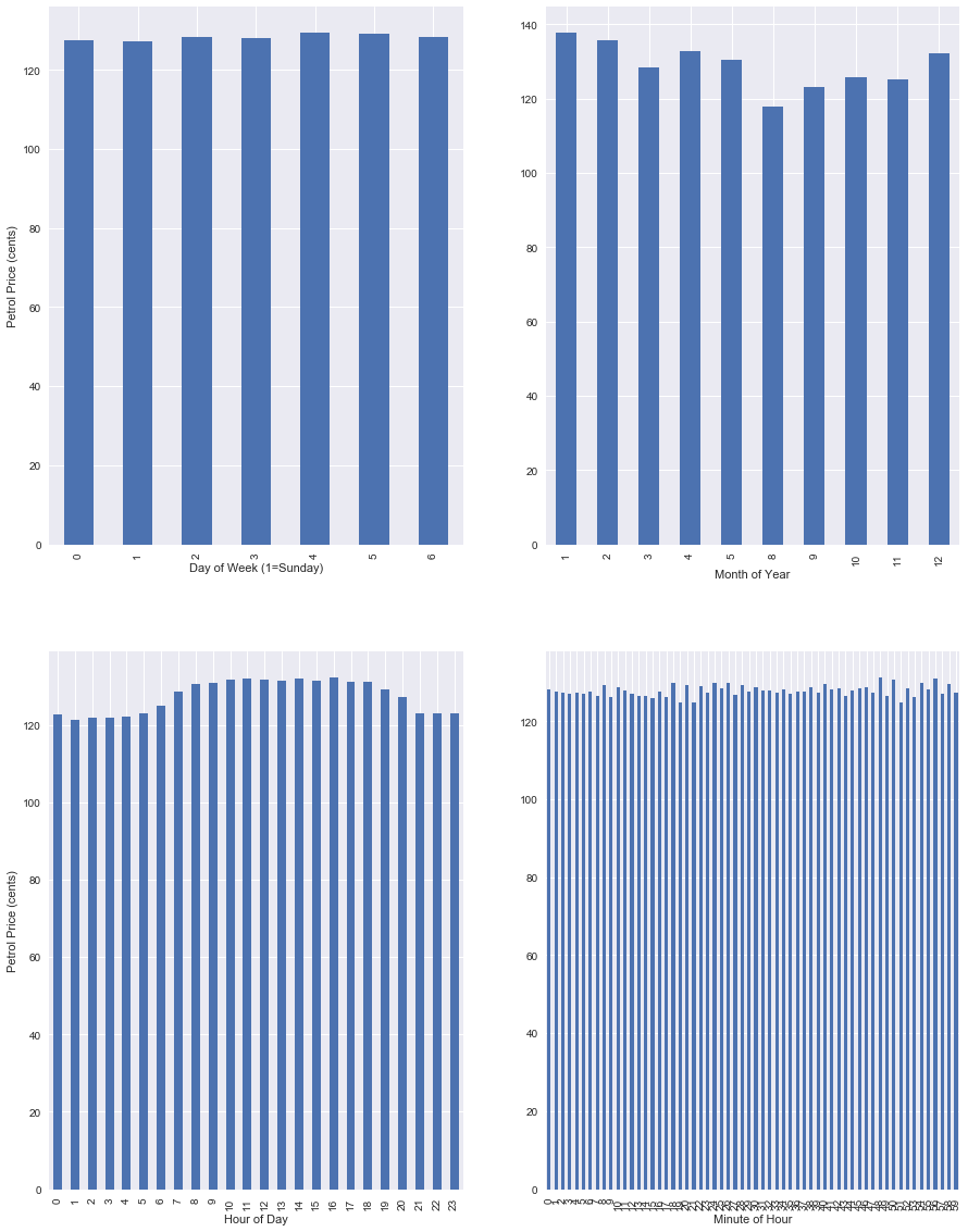
We see some interesting trends by looking at price averages based on certain time measures. We are fairly limited in some metrics due to the small size of the dataset (i.e. only 1.5 years of data),
- There seems to be no relation between day of week and price.
- August is coming out as the cheapest, but this is likely due to dataset size
- Petrol is cheapest in the morning and late at night
- There doesn’t seem to be any large trends across each hour.
Qualitative Variables - Brand and Location
Having looked at some basic trends across basic quantitative info, now we can dive into some more specific brand and location based trends.
df.groupby(['Brand'])['Price'].mean().sort_values(ascending=False).plot(kind='barh')
plt.show()
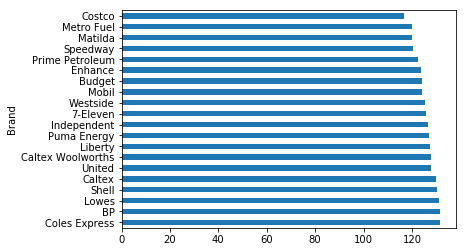
Not unsurprisingly, the major brand names Coles, BP, Caltex come out on top as the most expensive. On the bottom end we see Costco possibly using low pricing tactics to attract customers.
plt.figure(figsize=(30,10))
mean_postcode = df.groupby(['Postcode'])['Price'].mean().sort_values(ascending=False)
print(mean_postcode.head(10))
print('--------------------')
print(mean_postcode.tail(10))

mean_postcode.plot(kind='bar')
plt.show()
Postcode
2875.0    154.360000
2878.0    147.857143
2027.0    145.968966
2359.0    144.475000
2833.0    142.400000
2345.0    140.333333
2627.0    139.783399
2836.0    139.782353
2422.0    139.409348
2576.0    139.177982
Name: Price, dtype: float64
--------------------
Postcode
2587.0    118.833333
2668.0    118.577419
2163.0    118.546549
2321.0    117.344444
2726.0    116.900000
2643.0    116.564444
2319.0    116.448387
2056.0    114.365461
2609.0    110.227273
2000.0    101.737500
Name: Price, dtype: float64
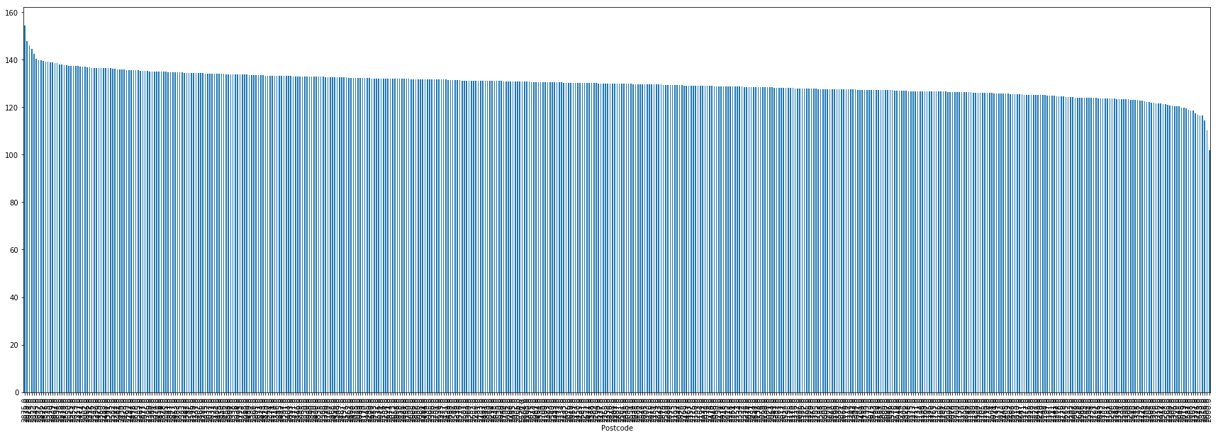
This shows us some quite interesting information. We see that the top two most expensive postcodes are quite rural country towns, whilst the third most expensive is located in a very expensive Sydney location. The rest of the top 10 are rounded out by mostly country/isolated towns.
On the bottom end, we see that the City of Sydney itself has the lowest petrol prices on offer. This is potentially due to sample size as there are only a small number of petrol stations in central Sydney.
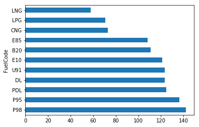
df.groupby(['FuelCode'])['Price'].mean().sort_values(ascending=False).plot(kind='barh')
plt.show()
f = plt.figure(figsize = (13,8))
ax = f.gca()
df_cat = df[['FuelCode', 'Price', 'DayDate']]
df_cat = df_cat.groupby(['DayDate', 'FuelCode']).mean()["Price"]
df_cat.unstack().plot(ax=ax)
box = ax.get_position()
ax.set_position([box.x0, box.y0, box.width*0.8, box.height])
plt.legend(title = "Fuel Codes", loc='center left', bbox_to_anchor=(1.0, 0.5))
plt.show()
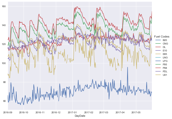
Not unexpectedly, we see some fairly strong trends in all the different types of fuels, based on their usage. I.e. we see things like P95, P98, E85, E10 all moving in the same trend.
Correlation Analysis
Let’s use Quandl to bring in some data and use Seaborn to look at the correlation across our entire dataset.
import quandl

quandl.ApiConfig.api_key = "quandlkey"
all_codes = ["CHRIS/CME_CL1.4","CHRIS/ASX_AP1.1"]
oil = quandl.get(all_codes, start_date=pd.datetime(2016,9,1), end_date = pd.datetime(2017,5,30))
oil = oil.pct_change()
tmp = df_cat.unstack()
changes = tmp.pct_change()
changes.drop(['B20', 'CNG', 'LNG'], 1, inplace=True)
changes = changes.merge(oil, left_index=True, right_index=True)
changes = changes.dropna()
plt.figure(figsize=(20,15))
sns.pairplot(changes, diag_kind='kde', kind='reg', markers="+")
plt.show()
<matplotlib.figure.Figure at 0x20246667940>
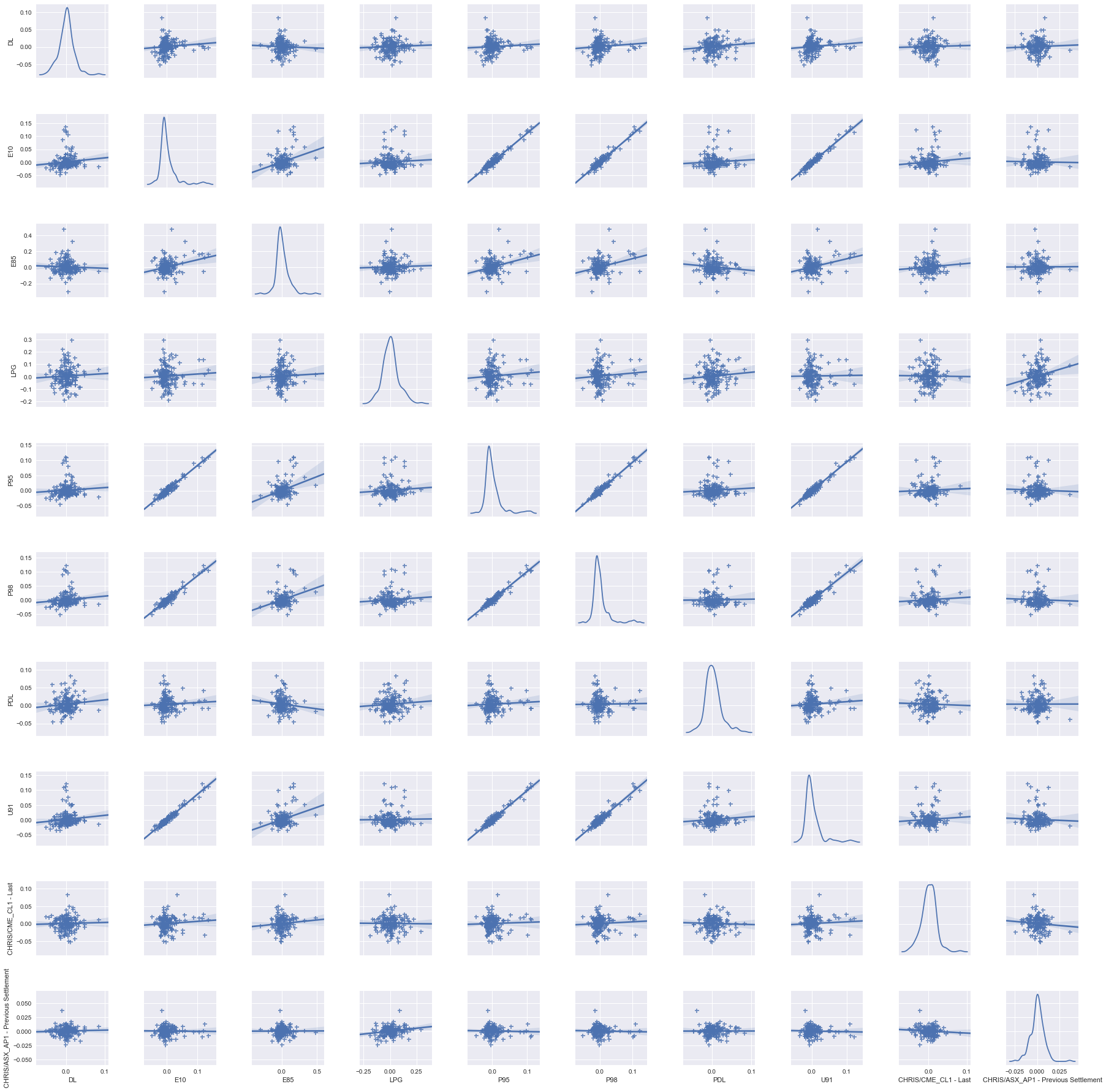
We do see some fairly strong correlation with all the different petrol prices, which lets us know that we can expect certain ones to move together with fairly strong confidence. This area is ripe for exploration and seeing if we can derive out any other variables which may influence petrol prices…tbd.
To Explore
- Time-series forecasting of petrol prices
- Produce some heatmaps showing changing petrol prices across NSW