An investigation into rates modelling: PCA and Vasicek models
Interest rates provide a fairly good standard for applying PCA and Vasicek stochastic modelling, and getting a good feel for the characteristics of these models. We implement PCA and a Vasicek short-rate model for swap rates, treasury rates and the spread between these two.
import pandas as pd
import numpy as np
import scipy as sp
import matplotlib.pyplot as plt
import seaborn as sns
import quandl
quandl.ApiConfig.api_key = 'QUANDL_API_KEY'
swap_names = ['FRED/DSWP1',
'FRED/DSWP2',
'FRED/DSWP3',
'FRED/DSWP4',
'FRED/DSWP5',
'FRED/DSWP7',
'FRED/DSWP10',
'FRED/DSWP30']
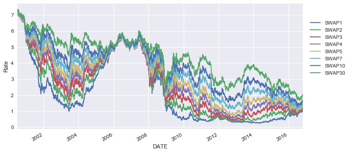
swap_df = quandl.get(swap_names)
swap_df = swap_df.dropna()
swap_df.columns = ["SWAP1",
"SWAP2",
"SWAP3",
"SWAP4",
"SWAP5",
"SWAP7",
"SWAP10",
"SWAP30"]
swap_df.head()
| SWAP1 | SWAP2 | SWAP3 | SWAP4 | SWAP5 | SWAP7 | SWAP10 | SWAP30 | |
|---|---|---|---|---|---|---|---|---|
| DATE | ||||||||
| 2000-07-03 | 7.10 | 7.16 | 7.17 | 7.17 | 7.17 | 7.20 | 7.24 | 7.24 |
| 2000-07-05 | 7.03 | 7.06 | 7.07 | 7.07 | 7.08 | 7.11 | 7.14 | 7.16 |
| 2000-07-06 | 7.07 | 7.13 | 7.14 | 7.15 | 7.16 | 7.19 | 7.21 | 7.21 |
| 2000-07-07 | 7.01 | 7.04 | 7.06 | 7.06 | 7.07 | 7.10 | 7.14 | 7.14 |
| 2000-07-10 | 7.04 | 7.09 | 7.11 | 7.13 | 7.14 | 7.17 | 7.20 | 7.19 |
swap_df2 = swap_df.copy()
swap_df.plot(figsize=(10,5))
plt.ylabel("Rate")
plt.legend(bbox_to_anchor=(1.01, 0.9), loc=2)
plt.show()
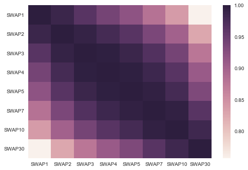
sns.heatmap(swap_df.corr())
plt.show()
Principal Component Analysis - Covariance Method
Implementing the PCA covariance algorithm is quite straight forward.
- Detrend the dataset by removing the mean of each column from our observations
- Calculate the covariance/correlation matrix
- Calculate the eigenvectors & eigenvalues which diagonalise the covariance/correlation matrix. We are wanting to solve \(V^{-1}CV = D\)
- Sort eigenvectors and eigenvalues based on decreasing eigenvalues (i.e. we take the eigenvalue contributing the most variance to out dataset as the first eigenvalue and so forth)
def PCA(df, num_reconstruct):

    df -= df.mean(axis=0)
    R = np.cov(df, rowvar=False)
    eigenvals, eigenvecs = sp.linalg.eigh(R)
    eigenvecs = eigenvecs[:, np.argsort(eigenvals)[::-1]]
    eigenvals = eigenvals[np.argsort(eigenvals)[::-1]]
    eigenvecs = eigenvecs[:, :num_reconstruct]

    return np.dot(eigenvecs.T, df.T).T, eigenvals, eigenvecs
scores, evals, evecs = PCA(swap_df, 7)
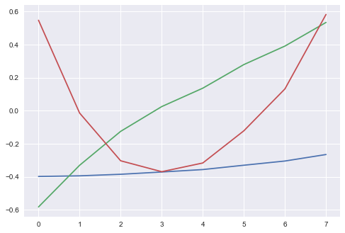
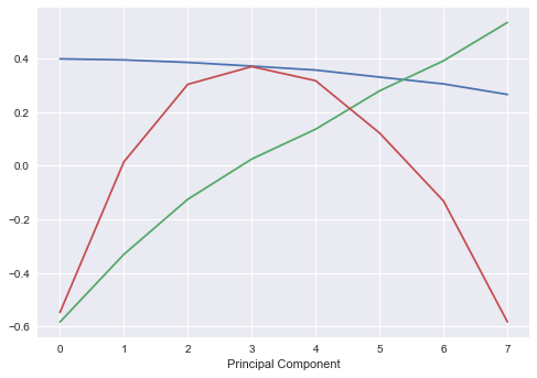
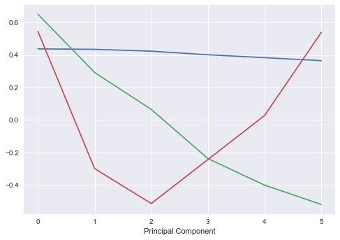
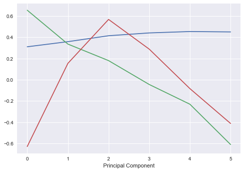
One of the key interpretations of PCA applied to interest rates, is the components of the yield curve. We can effectively attribute the first three principal components to:
- Parallel shifts in yield curve (shifts across the entire yield curve)
- Changes in short/long rates (i.e. steepening/flattening of the curve)
- Changes in curvature of the model (twists)
evecs = pd.DataFrame(evecs)
plt.plot(evecs.ix[:, 0:2])
plt.show()
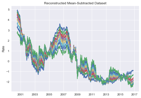
One of the key features of PCA is the ability to reconstruct the initial dataset using the outputs of PCA. Using the simple matrix reconstruction, we can generate an approximation/almost exact replica of the initial data.
reconst = pd.DataFrame(np.dot(scores,evecs.T), index=swap_df.index, columns=swap_df.columns)

plt.plot(reconst)
plt.ylabel("Rate")
plt.title("Reconstructed Mean-Subtracted Dataset")
plt.show()
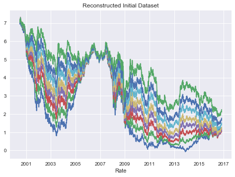
for cols in reconst.columns:
    reconst[cols] = reconst[cols] + swap_df2.mean(axis=0)[cols]

plt.plot(reconst)
plt.xlabel("Rate")
plt.title("Reconstructed Initial Dataset")
plt.show()
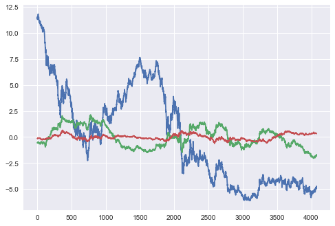
scores = pd.DataFrame(np.dot(eigenvecs.T, swap_df.T).T, index=swap_df.index, columns=swap_df.columns)
scores.plot()
plt.ylabel("Principal Component Scores")
plt.show()
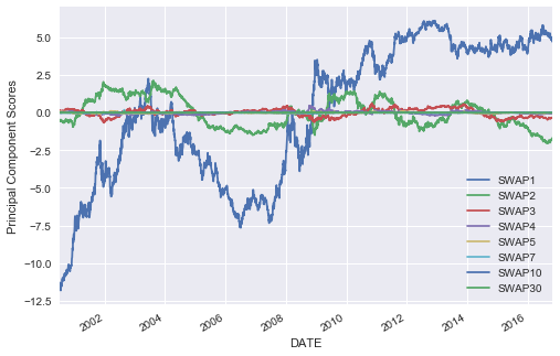
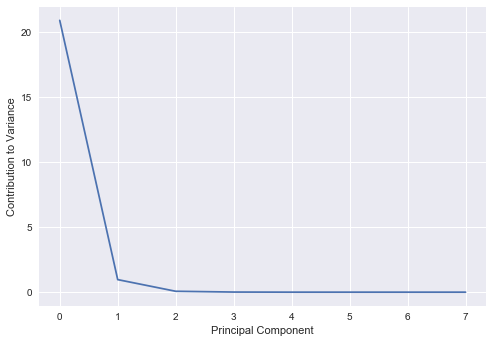
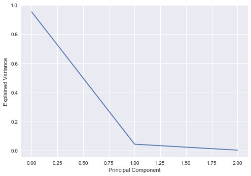
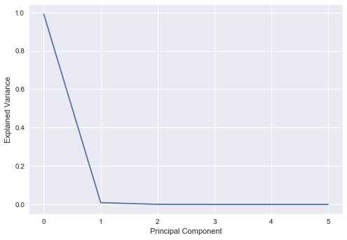
We see that the first 3 principal components account for almost all of the variance in the model, and thus we should just be able to use these three components to reconstruct our initial dataset and retain most of the characteristics of it.
plt.plot(evals)
plt.ylabel("Contribution to Variance")
plt.xlabel("Principal Component")
plt.show()
We implemented the raw model above, but we can also use the sklearn implementation to obtain the same results.
import sklearn.decomposition.pca as PCA
pca = PCA.PCA(n_components=3)
pca.fit(swap_df)
PCA(copy=True, iterated_power='auto', n_components=3, random_state=None,
  svd_solver='auto', tol=0.0, whiten=False)
plt.plot(pca.explained_variance_ratio_)
plt.xlabel("Principal Component")
plt.ylabel("Explained Variance")
plt.show()

plt.plot(pca.components_[0:3].T)
plt.xlabel("Principal Component")
plt.show()

vals = pca.transform(swap_df)
plt.plot(vals[:,0:3])
plt.show()
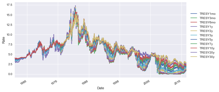
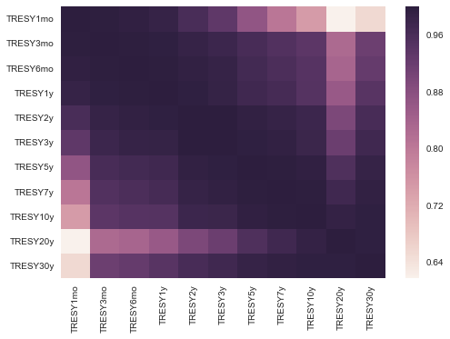
Treasury Rates
We can implement the same method that we did for swaps, to constant maturity treasury rates.
treasury = ['FRED/DGS1MO',
           'FRED/DGS3MO',
           'FRED/DGS6MO',
           'FRED/DGS1',
           'FRED/DGS2',
           'FRED/DGS3',
           'FRED/DGS5',
           'FRED/DGS7',
           'FRED/DGS10',
           'FRED/DGS20',
           'FRED/DGS30']

treasury_df = quandl.get(treasury)
treasury_df.columns = ['TRESY1mo',
                    'TRESY3mo',
                    'TRESY6mo',
                    'TRESY1y',
                    'TRESY2y',
                    'TRESY3y',
                    'TRESY5y',
                    'TRESY7y',
                    'TRESY10y',
                    'TRESY20y',
                    'TRESY30y']
treasury_df.plot(figsize=(10,5))
plt.ylabel("Rate")
plt.legend(bbox_to_anchor=(1.01,.9), loc=2)
plt.show()
sns.heatmap(treasury_df.corr())
plt.show()
treasury_df2 = treasury_df.ix[:, 3:-2]
treasury_df2 = treasury_df2.dropna()
comb_df = treasury_df2.merge(swap_df2, left_index=True, right_index=True)
pca_t = PCA.PCA(n_components=6)
pca_t.fit(treasury_df2)
PCA(copy=True, iterated_power='auto', n_components=6, random_state=None,
  svd_solver='auto', tol=0.0, whiten=False)
plt.plot(pca_t.explained_variance_ratio_)
plt.ylabel("Explained Variance")
plt.xlabel("Principal Component")
plt.show()
plt.plot(pca_t.components_[0:3].T)
plt.xlabel("Principal Component")
plt.show()
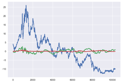
vals_t = pca_t.transform(treasury_df2)
plt.plot(vals_t[:,0:3])
plt.show()
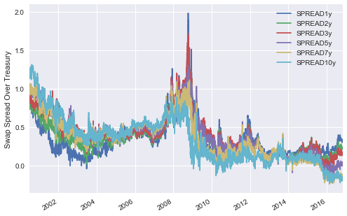
Spreads
We see above fairly similar PCA results between the swap rates and treasury rates. Perhaps a more interesting investigation is the spread between these two rates. We expect that the spread of swap over treasury should mostly be positive, given that swaps are being priced off bank credit whilst constant treasuries should be priced off the Government credit.
spread = [comb_df.SWAP1-comb_df.TRESY1y,
        comb_df.SWAP2-comb_df.TRESY2y,
       comb_df.SWAP3-comb_df.TRESY3y,
       comb_df.SWAP5-comb_df.TRESY5y,
       comb_df.SWAP7-comb_df.TRESY7y,
       comb_df.SWAP10-comb_df.TRESY10y]
spread_df = pd.DataFrame(np.array(spread).T, index=comb_df.index,
                         columns = ["SPREAD1y", "SPREAD2y", "SPREAD3y", "SPREAD5y", "SPREAD7y", "SPREAD10y"])
spread_df.plot()
plt.ylabel("Swap Spread Over Treasury")
plt.show()
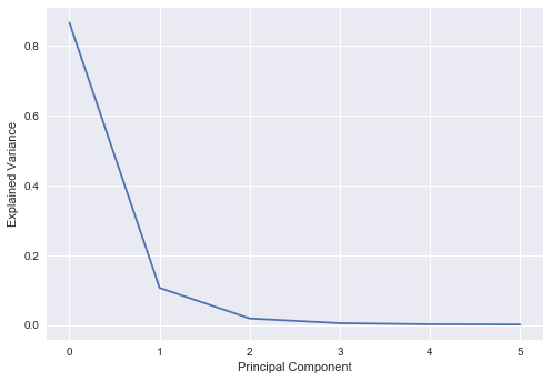
pca_spread = PCA.PCA(n_components=6)
pca_spread.fit(spread_df)
PCA(copy=True, iterated_power='auto', n_components=6, random_state=None,
  svd_solver='auto', tol=0.0, whiten=False)
Interestingly, we see fairly similar results between the spread PCA and swap/treasury PCA.
plt.plot(pca_spread.explained_variance_ratio_)
plt.xlabel("Principal Component")
plt.ylabel("Explained Variance")
plt.show()

plt.plot(pca_spread.components_[0:3].T)
plt.xlabel("Principal Component")
plt.show()

vals_s = pca_spread.transform(spread_df)
plt.plot(vals_t[:,0:3])
plt.show()

Rates Simulation
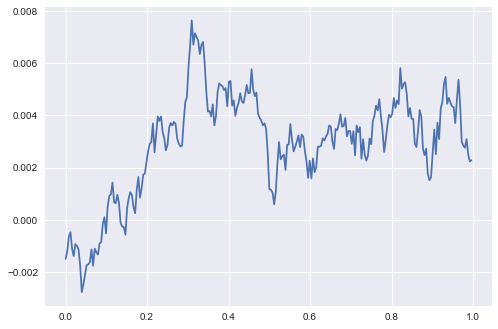
Of interest in spreads is the strong mean reversion we see. We can use a pretty basic stochastic model, the Vasicek short-rate model to simulate out spreads. The typical implementation uses MLE to derive out the key parameters of the following model: \(dr_t = \kappa (\theta - r_t)dt + \sigma dW\) where $\kappa$ represents the mean reversion strength, $\theta$ is the long-run mean and $\sigma$ is the volatility. The basic approach is to calibrate kappa, theta and sigma based on a historical dataset and then use it in Monte Carlo modelling of rate paths.
Below code is an implementation from Puppy Economics in Python.
We simulate the rates path using a closed form solution:
\[r_{t_i} = r_{t_{i-1}}exp(-\kappa(t_i - t_{i-1})) + \theta(1-exp(-\kappa(t_i - t_{i-1}))) + Z\sqrt{\frac{\sigma^2(1-exp(-2\kappa(t_i - t_{i-1})))}{2\kappa}}\]where $ Z \sim N(0,1) $
def VasicekNextRate(r, kappa, theta, sigma, dt=1/252):
    # Implements above closed form solution

    val1 = np.exp(-1*kappa*dt)
    val2 = (sigma**2)*(1-val1**2) / (2*kappa)
    out = r*val1 + theta*(1-val1) + (np.sqrt(val2))*np.random.normal()
    return out
def VasicekSim(N, r0, kappa, theta, sigma, dt = 1/252):
    short_r = [0]*N # Create array to store rates
    short_r[0] = r0 # Initialise rates at $r_0$


    for i in range(1,N):
        short_r[i] = VasicekNextRate(short_r[i-1], kappa, theta, sigma, dt)

    return short_r
def VasicekMultiSim(M, N, r0, kappa, theta, sigma, dt = 1/252):
    sim_arr = np.ndarray((N, M))

    for i in range(0,M):
        sim_arr[:, i] = VasicekSim(N, r0, kappa, theta, sigma, dt)

    return sim_arr
def VasicekCalibration(rates, dt=1/252):
    n = len(rates)

    # Implement MLE to calibrate parameters
    Sx = sum(rates[0:(n-1)])
    Sy = sum(rates[1:n])
    Sxx = np.dot(rates[0:(n-1)], rates[0:(n-1)])
    Sxy = np.dot(rates[0:(n-1)], rates[1:n])
    Syy = np.dot(rates[1:n], rates[1:n])

    theta = (Sy * Sxx - Sx * Sxy) / (n * (Sxx - Sxy) - (Sx**2 - Sx*Sy))
    kappa = -np.log((Sxy - theta * Sx - theta * Sy + n * theta**2) / (Sxx - 2*theta*Sx + n*theta**2)) / dt
    a = np.exp(-kappa * dt)
    sigmah2 = (Syy - 2*a*Sxy + a**2 * Sxx - 2*theta*(1-a)*(Sy - a*Sx) + n*theta**2 * (1-a)**2) / n
    sigma = np.sqrt(sigmah2*2*kappa / (1-a**2))
    r0 = rates[n-1]

    return [kappa, theta, sigma, r0]
params = VasicekCalibration(spread_df.ix[:, 'SPREAD10y'].dropna()/100)
kappa = params[0]
theta = params[1]
sigma = params[2]
r0 = params[3]

years = 1
N = years * 252
t = np.arange(0,N)/252

test_sim = VasicekSim(N, r0, kappa, theta, sigma, 1/252)
plt.plot(t,test_sim)
plt.show()
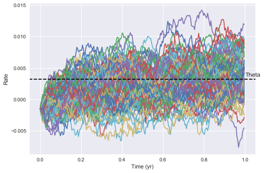
We can simulate starting from $r_0 = last observed value$ and generate a series of paths which “forecast” out potential rate paths from today.
M = 100
rates_arr = VasicekMultiSim(M, N, r0, kappa, theta, sigma)

plt.plot(t,rates_arr)
plt.hlines(y=theta, xmin = -100, xmax=100, zorder=10, linestyles = 'dashed', label='Theta')
plt.annotate('Theta', xy=(1.0, theta+0.0005))
plt.xlim(-0.05, 1.05)
plt.ylabel("Rate")
plt.xlabel("Time (yr)")
plt.show()
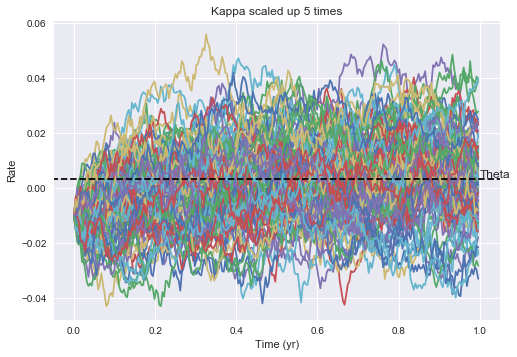
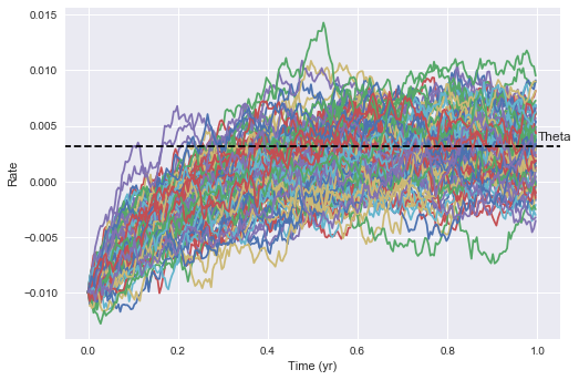
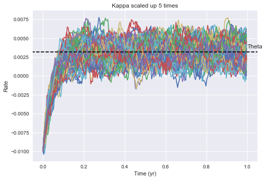
To observe the mean reverting nature of the model, we can specify $r_0$ further away from theta. We can clearly see that the rates are being pulled towards theta over time, and the speed of this reversion is controlled by the magnitude of kappa. The larger kappa, the quicker mean reversion we’d expect to see. The larger sigma is, the more volatility we expect to see and the wider potential rate distributions. ***titles on below need to be fixed.
M = 100
rates_arr = VasicekMultiSim(M, N, -0.01, kappa, theta, sigma)
plt.plot(t,rates_arr)
plt.hlines(y=theta, xmin = -100, xmax=100, zorder=10, linestyles = 'dashed', label='Theta')
plt.annotate('Theta', xy=(1.0, theta+0.0005))
plt.xlim(-0.05, 1.05)
plt.ylabel("Rate")
plt.xlabel("Time (yr)")
plt.show()
M = 100
rates_arr = VasicekMultiSim(M, N, -0.01, kappa*5, theta, sigma)
plt.plot(t,rates_arr)
plt.hlines(y=theta, xmin = -100, xmax=100, zorder=10, linestyles = 'dashed', label='Theta')
plt.annotate('Theta', xy=(1.0, theta+0.0005))
plt.xlim(-0.05, 1.05)
plt.ylabel("Rate")
plt.xlabel("Time (yr)")
plt.title("Kappa scaled up 5 times")
plt.show()
M = 100
rates_arr = VasicekMultiSim(M, N, -0.01, kappa, theta, sigma*5)
plt.plot(t,rates_arr)
plt.hlines(y=theta, xmin = -100, xmax=100, zorder=10, linestyles = 'dashed', label='Theta')
plt.annotate('Theta', xy=(1.0, theta+0.0005))
plt.xlim(-0.05, 1.05)
plt.ylabel("Rate")
plt.xlabel("Time (yr)")
plt.title("Kappa scaled up 5 times")
plt.show()